
AI Project: Fitness App
A personal fitness tracker built entirely by directing Claude: no prior coding background. It tracks gym sessions, cardio, and stretching, with progress and streaks, injury-safe exercise selection, built-in variety so routines never go stale, and data that syncs across every device. Built to solve a specific rehab problem no off-the-shelf app quite fit.
Demo login on request → hello@loe.kim
Why I built it
This was my first project as a builder rather than a writer of prompts alone. I had a nagging groin/glute injury that needed specific rehab, a general fitness goal on top of it, and a habit of getting stuck doing the same exercises and stretches on repeat. I looked for an existing app that would track my progress, steer me toward exercises that respected the injury, and keep enough variety that I’d actually stick with it. Nothing quite fit, so I built it.
The journey
1. Planning before a single line of code
Before opening Claude, I mapped the app out, on paper, starting with the daily flow, what a "session" actually consists of, what needed to sync across devices, and potentail rules and option trees. That brainstorm became a written project brief, which became the first prompts, setting up a back-and-forth planning dialogue with Claude.
2. The data model: what we're storing, how it's structured, and how it relates
- Ask clarifying questions before locking anything in. Don't assume defaults on my behalf, especially anywhere the injury tracking intersects with regular training.
- Surface tradeoffs, not just options. If there are two reasonable ways to structure something, tell me the tradeoffs of each rather than picking one silently.
- Push back if something I describe will paint us into a corner later. I'd rather hear it now than discover it after the data model is built.
- Keep it scoped to planning: screens and data model only for now, no tech stack decisions, no code, no UI polish, until we've locked both down.
- A list of core screens with a one-line purpose for each, and how they connect
- A data model: entities, key fields, and relationships, that explicitly accounts for regular training, rehab-specific tracking for the injury, and anything that needs to persist across days (progress, trends, symptoms, PRs)
2. Building the core loop
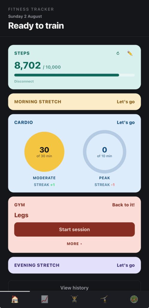
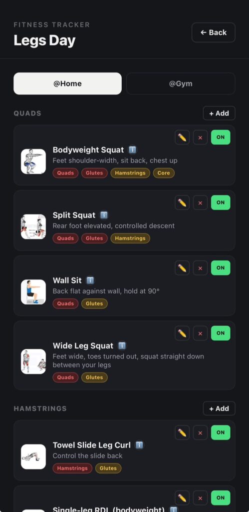
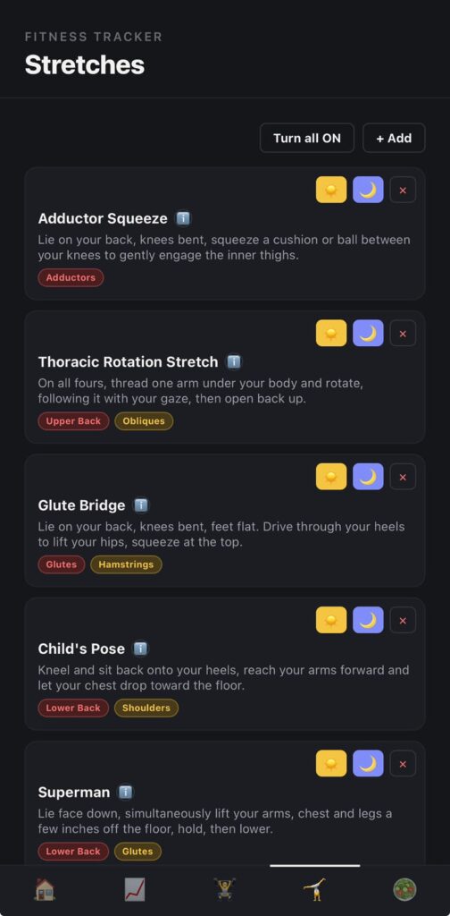
The first real version was the daily loop: Morning Stretch, Cardio, Gym, Evening Stretch, plus a Progress view and an exercise library. The interesting decisions weren't the screens themselves, they were the rules underneath: what counts as a "complete" day, how a streak breaks, and how gym exercises get picked so the injury never gets aggravated and each session targets the correct muscles, in the correct order, and with variety.
- What counts as a "complete" day
- How and when a streak breaks
- How gym exercises get selected each session, so the injury is never aggravated, the right muscles get hit in the right order, and the plan doesn't go stale through repetition
- Are all four steps mandatory for a day to count as "complete," or are some conditional (e.g., is Cardio optional on a lifting-only day, is Gym optional on a rest day)?
- Does partial completion mean anything, or is it binary: complete or not?
- Does the order matter (e.g., can Gym happen before Cardio and still count), or only that all required pieces happened?
- What happens on a day I intentionally schedule as rest? Does it need its own state, or does it just not count against me?
- Does "complete" apply per-day only, or does a day's completion depend on anything from the day before (e.g., did I follow the prescribed rehab stretch, not just any stretch)?
- What breaks a streak: any incomplete day, or only missing certain required steps?
- Does a planned rest day pause the streak, break it, or not interact with it at all?
- If I'm managing an injury and need to skip Gym on doctor's or PT advice, should that be able to break a streak the same way skipping out of laziness does? Or do we need some notion of an "excused" day?
- Is there a grace mechanism (e.g., one skip per week doesn't break it), or is it strict?
- How do we handle the boundary case where I complete steps late, after midnight, or catching up the next morning?
- What's the mechanism for marking an exercise as unsafe, risky, or conditional given the groin/glute injury: a hard exclude list, a risk tier, or something that changes based on how the injury is doing that week?
- Does safety status ever change (e.g., an exercise moves from "excluded" to "conditional, low-load only" as rehab progresses), and if so, what drives that: a manual update from me, or milestones/rules we define?
- If an exercise is borderline, does the app substitute automatically or flag it for me to decide?
- What's the source of truth for "correct order": a fixed template (e.g., compound before isolation, large muscle groups before small), or something derived from the exercise library's metadata (muscle group, mechanical demand, injury proximity)?
- How do we sequence around the injury specifically? Does anything touching the groin/glute area need to go earlier, later, or be paired with something protective?
- Does the order need to adapt based on what Morning Stretch or Cardio already did that day (e.g., don't hit the same tissue twice back-to-back)?
- What's "enough" variety: no exact repeat of last session, no repeat within N sessions, or rotation through defined variants of the same movement pattern?
- If variety and injury-safety conflict (the "fresh" option is riskier than the repeat), which wins, and how does the app resolve it rather than silently picking one?
- Does variety apply per muscle group, per session, per week? What's the actual unit we're rotating over?
2. Once we've answered them, restate the rule set back to me in plain language so I can confirm or correct it
3. Only after all three are locked, summarize how they interact (e.g., does a day where the algorithm swaps in a safe substitute still count as "complete"?)
3. From prototype to real software
The initial build existed only as an ephemeral browser session: no persistent storage, no user accounts, and no state once the tab closed. The next milestone was making the app survive beyond a single session, persisting across devices so it would follow me between phone and laptop. That required introducing a genuine backend, including authentication and cloud-based data storage.
Since I had limited prior experience with backend architecture, authentication systems, or cloud databases, I approached this phase as a guided learning process, working alongside Claude as a tutor who explained not just the implementation steps but the reasoning behind each decision. Concretely, this meant hosting the app as a page within my personal website and integrating Firebase to handle authentication and cloud data storage.
- What we're doing
- Why we're doing it that way instead of an obvious alternative
- What would break or go wrong if we skipped or misconfigured this step
- Hosting: the app becomes a page on my existing personal website rather than a standalone deployment
- Authentication: users (starting with just me) can register and log in
- Cloud storage: the data that currently lives only in the browser (the daily loop entries, exercise library, progress data) needs to persist in a cloud database and sync correctly across devices
- Authentication method: email and password, Google sign-in, anonymous auth with an upgrade path, or some combination, and why one fits my situation (a personal app, not a public product) better than the others
- Database choice within Firebase: Firestore versus the Realtime Database, and what about my data (the daily loop, exercise library, rehab-specific fields we defined earlier) makes one a better fit
- Data structure in the cloud: how the data model we already designed maps onto collections and documents, and what changes now that data belongs to a specific user instead of just living in one browser
- Security rules: how we make sure only I can read or write my own data, and what a misconfigured rule would expose if we got it wrong
- Local development versus live site: how I test changes safely before they touch the real Firebase project connected to my actual site and data
- Explain in my own words how a user logging in connects to data being stored and retrieved in the cloud
- Know where in the Firebase console I'd go to check or fix something if it broke
- Understand why we chose the specific auth method and database structure we land on, not just that we chose them
- Have the app live on my personal website, with my data persisting and syncing between devices
4. The debugging arc
This stage was where the real engineering work happened. Some of the bugs encountered were genuinely serious, including several that cost significant data.
As the app grew in complexity, it became essential to diagnose issues methodically, working through hypotheses and root causes collaboratively with Claude rather than applying surface-level fixes. This process included prompting Claude to hardcode starter data and build functionality for editing, adding, downloading, and uploading data.
Notable issues included:
- A silent write failure: Firestore was rejecting saves because part of the data was structured as an array of arrays, a format it doesn't support. The fix wasn't a simple patch. It required restructuring that data and auditing the rest of the codebase for the same pattern.
- A timezone bug: entries were being dated in UTC rather than local time, meaning anything logged in the evening sometimes landed on the wrong calendar day.
- Multiple rounds of race conditions between saving and loading data, which on more than one occasion wiped out session history and progress entirely. Resolving this took genuine back and forth: reading console logs together, forming a hypothesis, testing it, and being honest when the first, and second, fix didn't fully hold.
The lasting solution wasn't patching each bug individually. It was introducing a rolling automatic backup as a genuine safety net, ensuring that a future bug could never again cause unrecoverable damage.
- Theorize with me first. Walk through why a UTC versus local time mismatch would produce exactly this symptom (the wrong day, specifically after evening hours, not at some other time). If the evidence doesn't fully support the UTC theory, tell me and help me think through what else could cause it.
- Find where the bug actually lives. Show me everywhere in the codebase that a date or timestamp gets created, stored, or compared, since a bug like this often hides in more than one place (when the entry is saved, when it's displayed, when it's grouped by day for the Progress view, and so on).
- Explain the fix in plain language before making it. I want to understand what was actually wrong, not just see a diff. Explain it the way you would to someone who isn't a backend expert: what UTC versus local time means in practice, why the bug only shows up in the evening, and why the fix resolves it rather than just moving the symptom somewhere else.
- Check for the same pattern elsewhere. If this bug exists in one place, it may exist anywhere else dates are handled. Audit the rest of the app for the same mistake rather than only fixing the one spot I noticed.
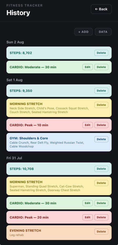
- Manually add an entry for a specific day
- Edit an existing entry, including its date
- Delete an entry
- Do all of the above for previous days, not just today, so I can go back and correct anything that was misdated by this bug
- A clear, plain-language explanation of every bug found, including this one and anything related that turns up during the audit
- Confirmation of the root cause before the fix is written, not after
- The manual add, edit, and delete functionality treated as a real feature, with its own brief design discussion, not bolted on as an afterthought
5. Design system iteration
Once the app was functionally complete, the interface remained purely utilitarian: dark cards with no visual hierarchy. Design isn't a strength of mine, so this stage was deliberately structured as a collaborative process rather than either dictating a rigid specification or ceding creative control entirely to Claude. That balance is the core discipline of effective vibe coding: providing enough direction and taste to keep the output aligned with intent, while leaving enough room for genuine collaborative iteration.
I began by gathering reference material: screenshots of apps, individual UI components, and colour palettes that reflected the direction I wanted. Rather than moving straight into code, the redesign process started with mockups, allowing a visual direction to be evaluated and refined before any implementation commitment was made.
I also set myself one governing constraint early on and held to it throughout the redesign: green is reserved exclusively for signaling completion, never used as a general category colour. It's a small rule, but it's the detail that separates a coherent, meaningful colour system from a palette that simply looks pleasant.
- Tell me specifically what's working in it, not just that it looks good (is it spacing, contrast, a particular use of colour, typography, information density, something else)
- Tell me what wouldn't translate well to this app's context (a daily tracking and rehab tool is a different design problem than, say, a social app or a game)
- Help me identify the throughline across the references, since I likely won't be able to articulate it myself even though I recognize it when I see it
- Mockups before code. I want to see and react to a visual direction before anything gets implemented. Don't jump to component code until we've agreed on a direction.
- A small number of directions, not one. Give me two or three distinct directions to react to rather than a single polished proposal, so I'm actually choosing rather than just approving.
- Explain the system, not just the look. I don't just want something that looks nice. I want to understand the logic behind decisions (why this hierarchy, why this palette, why this treatment for cards versus buttons) so I can tell if a future addition fits or breaks the system.
- 📎 PNG - App design 1.png - 2.4 MB
- 📎 PNG - App design 2.png - 4.8 MB
- 📎 PNG - App design 3.png - 1.9 MB
- 📎 PNG - App design 4.png - 3.6 MB
6. Integrating outside the app
By this stage the app was fully functional and stable, with several days of consistent, bug-free use behind it. Through actual daily use, a gap became apparent: steps, a core fitness metric I was tracking against a 10,000-plus daily goal, was missing entirely. I had been relying on a separate app to measure it and wanted that data pulled directly into my own tool instead of tracked in parallel.
I raised this with Claude as a goal rather than a specification. It confirmed the idea was feasible but noted that direct integration with Apple's Health app wasn't possible. When I mentioned that I personally used Pacer to track steps, a deeper search turned up something useful: Pacer exposes a developer API. That opened a real path forward, but it also introduced a genuine technical obstacle: the browser couldn't call Pacer's API directly due to CORS restrictions.
The goal at that point wasn't to route around the restriction with a partial workaround, but to solve it properly. That meant building a small server-side proxy to make the request on the app's behalf, sitting between the browser and Pacer's API. Working through this with Claude, testing possible solutions live as we went, we arrived at a working integration that pulls steps data directly from Pacer into the app, completing the final feature and, with it, the build.
2. Understanding the CORS problem before we solve it. I want a real explanation of why the browser can't call Pacer's API directly, in plain terms, not just "CORS is blocking it." Explain what CORS is actually protecting against and why that protection applies here.
3. Building the real fix, not a workaround. I don't want a fragile client-side hack that half-works. I want an actual server-side proxy that makes the request to Pacer on the app's behalf. Explain why this is the correct solution rather than the alternatives, and what it protects against that a workaround wouldn't.
4. Testing this live, together, as we go. I expect this integration will hit real problems (authentication failures, unexpected response formats, rate limiting, edge cases in how steps data is returned) and I want to be part of finding and fixing them, not just told it's done. Use me to test: tell me exactly what to try, what you expect to happen, and what result would tell us something is wrong.
- Tell me clearly what broke and what you think the actual cause is, before jumping to the next attempted fix
- If a fix doesn't fully hold, say so directly rather than presenting it as solved
- If we hit a genuine wall, like a limitation of the Pacer API itself, tell me plainly rather than quietly working around it in a way I wouldn't notice
- Steps data pulls successfully from Pacer into the app through the server-side proxy
- I understand why the proxy was necessary and roughly how it works, not just that it works
- Any bugs we hit along the way, and how we diagnosed and fixed them, are explained clearly enough that I could describe the process myself afterward
- This is confirmed through actual live testing on my end, not just a description of expected behavior
What I learned
The biggest shift wasn't learning to prompt. It was learning to direct.
Specificity was the recurring lesson across every stage of this build. A vague bug report got a vague guess back. An exact console output, an exact reproduction sequence, and a clear description of expected versus actual behavior got a real diagnosis and a real fix, the difference visible directly in how the timezone bug and the Firestore write failure were actually resolved rather than papered over.
The same principle held for testing. Deliberately testing across devices, at odd hours, and against intentionally rough edge cases surfaced the bugs that actually mattered, including the race conditions that put real data at risk, rather than only the bugs that were convenient to stumble across in normal use. Passive testing finds what's in front of you. Deliberate testing finds what's actually broken.
Design worked the same way. Establishing a visual direction through mockups and reference material before any code was written prevented exactly the kind of costly rework that comes from building against a specification that was never actually agreed on. Locking a rule like green meaning "complete," and nothing else, before implementation began is the same discipline as a tight creative brief: it's cheaper to fix a direction on paper than to unwind it in a finished product.
This is the throughline back to the writing and creative-management side of my background. The skill underneath this entire project was never really about knowing syntax. It was about asking good questions, being precise about what "done" actually means before starting, and knowing when a first answer, even a working one, wasn't the right one, and needed to be pushed on rather than accepted.
Building this app didn't require becoming an engineer. It required treating an AI collaborator the way I'd treat any capable creative partner: with clear intent, honest feedback, and the judgment to know the difference between a solution and a shortcut.